Forum Discussion

Todd's avatar
9 years ago

Enhanced Reports with Graphs and Alert Trending

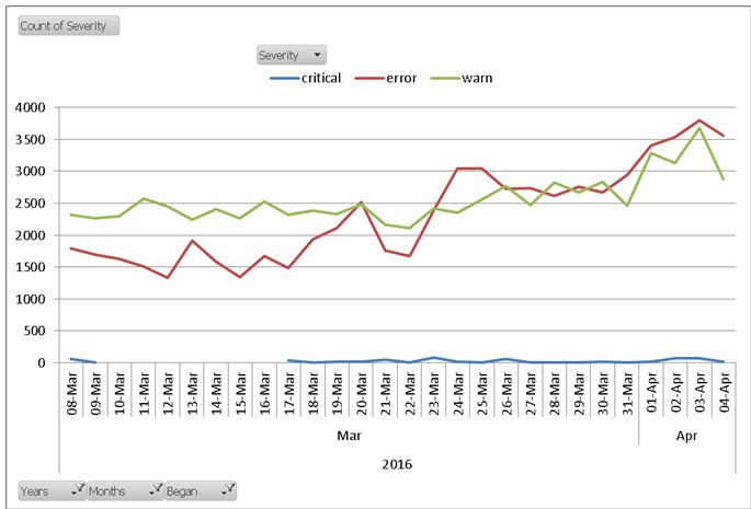
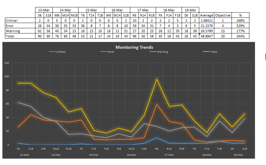
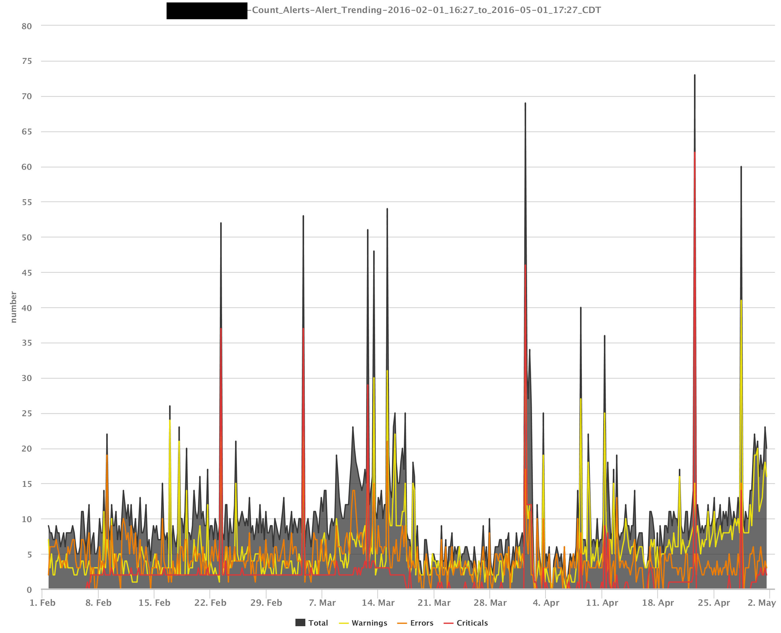
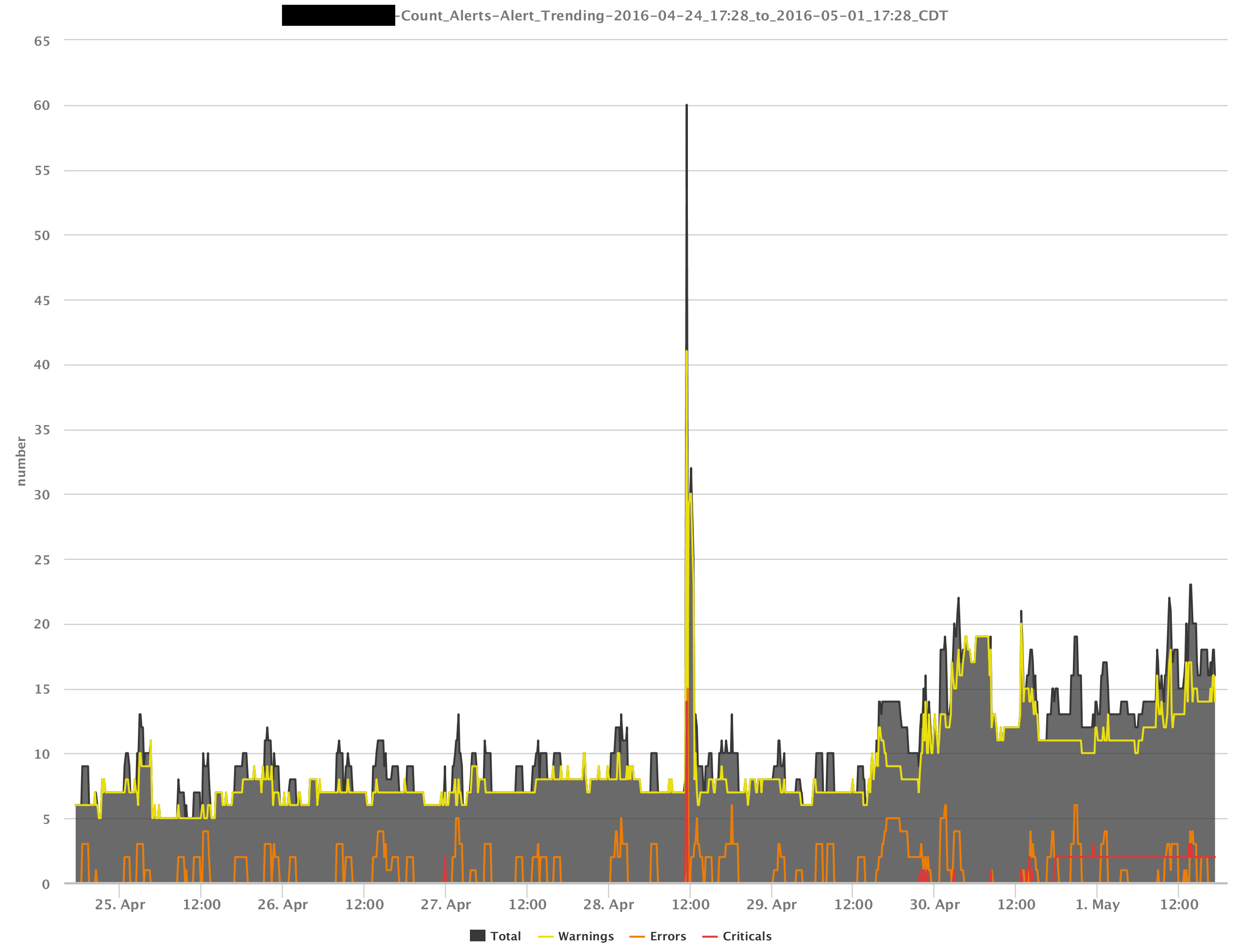
As we have implemented LogicMonitor we have worked to stabilize and tune alerts as well as to remediate real problems identified by alerts.  To track this progress we wanted to graph the alerts overtime.  We sort the alerts into several categories such as severity, group, device.  To do this we have to create a detailed report, pull the data into Excel and create pivot tables and pivot charts.  Create alert trend charts in LogicMonitor reports, directly, would be a valuable tool for teams working to drive down the alert counts.

Attached is a simple graph we have created multiple times in Excel as an example.  We have others.

Thanks.

Todd Kelley

4 Replies

Replies have been turned off for this discussion
  • Hi Todd - This is great.  Can you tell us more about what information you take into account?  Is it just active alerts at end of day?  Do you care about SDT or acknowledged status?

  • I would love to see this feature. We are doing basically the same thing as Todd using Excel to track alerting trends. We are looking into ways to automate this and a simple graph on a dashboard would be ideal. We are looking into implementing this with API calls as well but a graph with in LogicMonitor would be the simplest solution.


  • I've been thinking about doing this as a datasource for some time considering a lot of this information would be easily available by doing a web based call. 

    The data that would be collected would be more about the number of alerts generated during that day, including recurring alerts.